
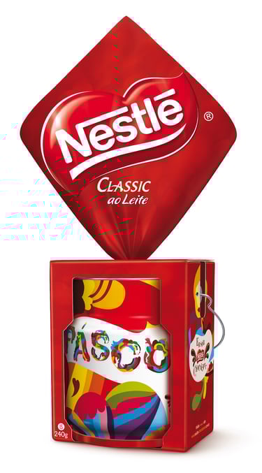
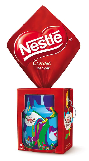
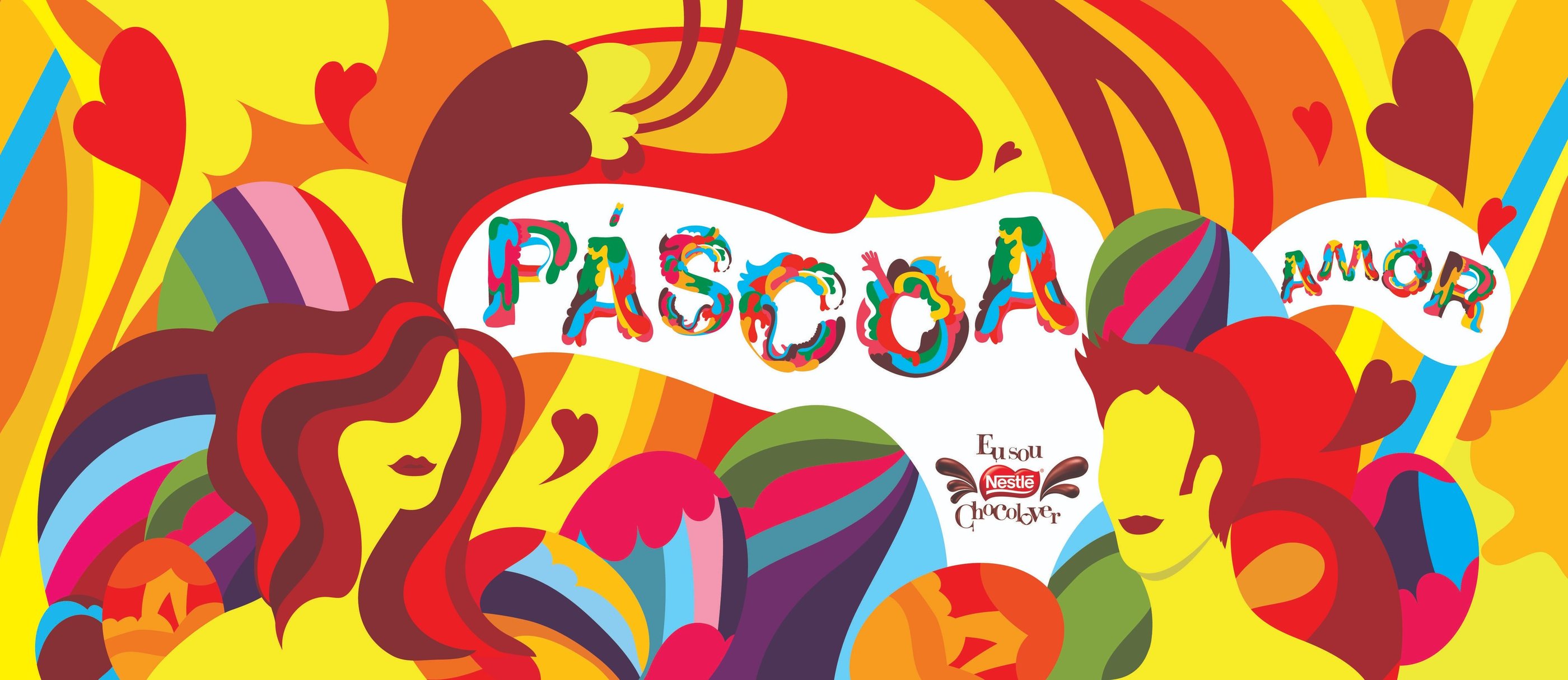
Páscoa Nestlé - Chocolate Easter Cans

Click on the image to view the full illustration.
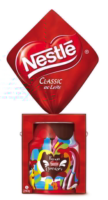
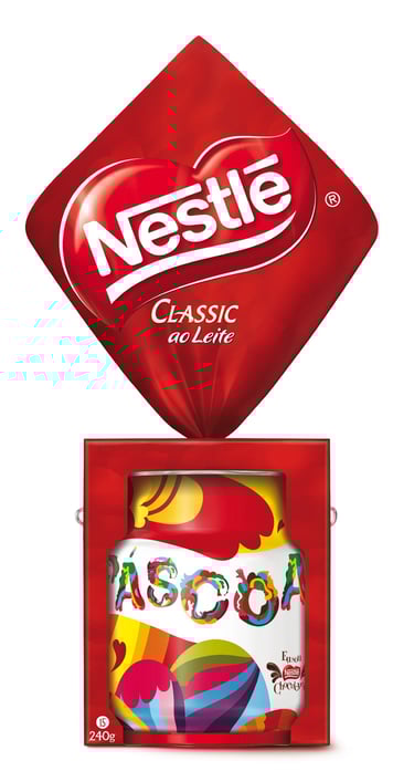
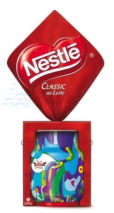
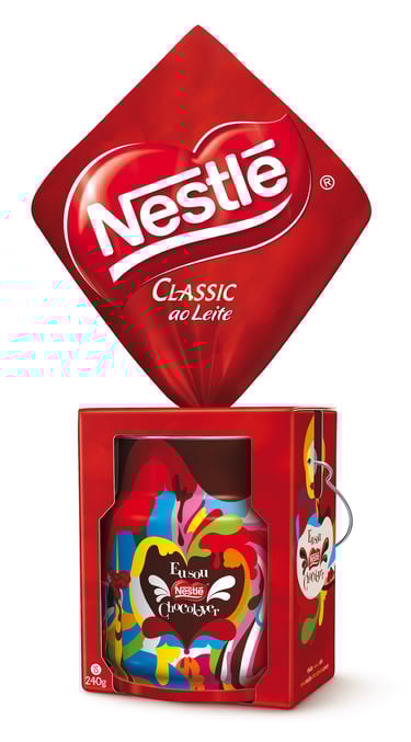
The Project: A collectible line of limited-edition tins for Nestlé Classic Easter eggs, commissioned by the agency FutureBrand.
The Brief: Open theme. It had to appeal to all ages.
The Question: How do you stand out in a category where every package is essentially selling the same thing?
The Insight: Easter had become a victim of its own familiarity. Everyone knows the bunny, the egg, the chocolate but almost no one stops to think about what this celebration really means. On a saturated shelf, differentiation wasn’t about shouting louder, but about telling something no one else was telling.
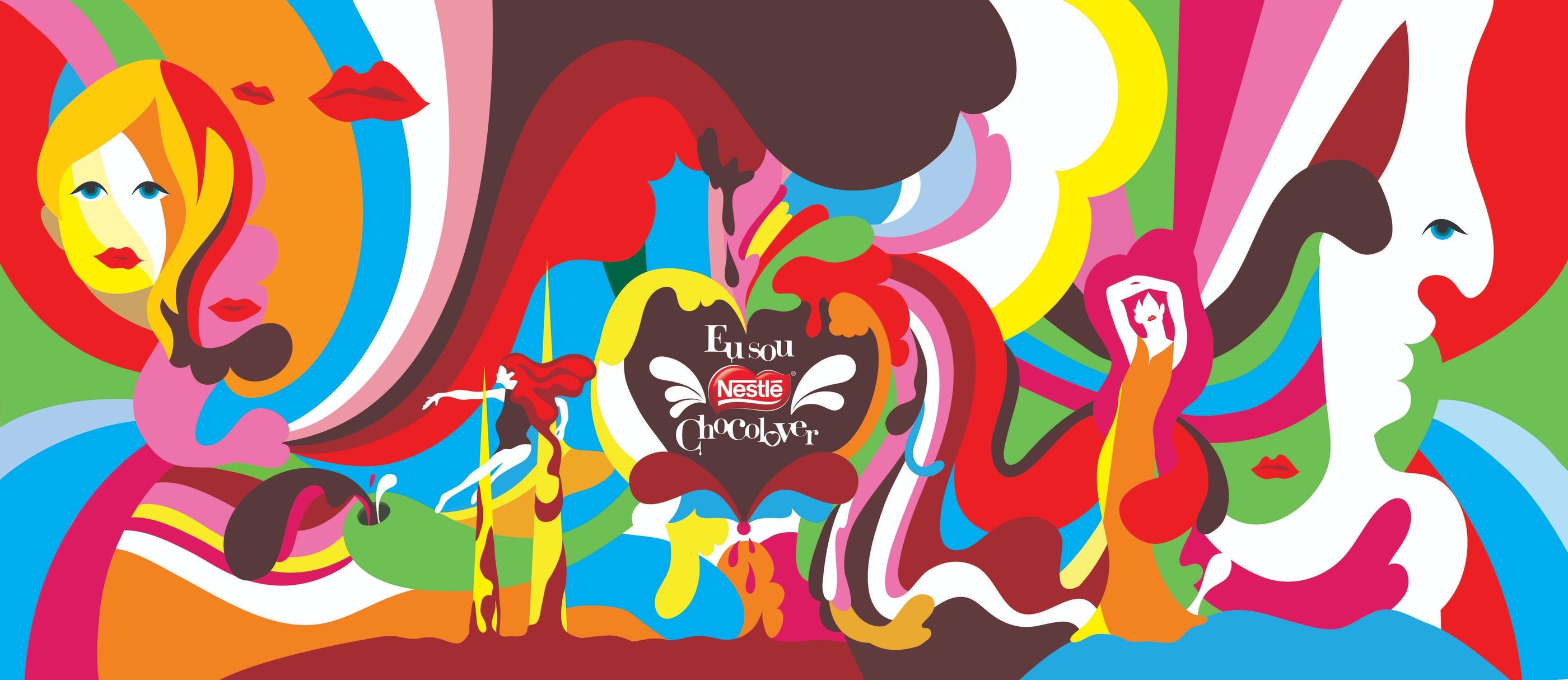
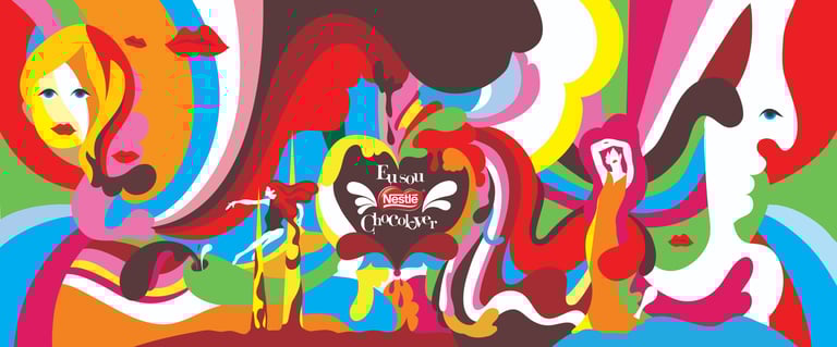
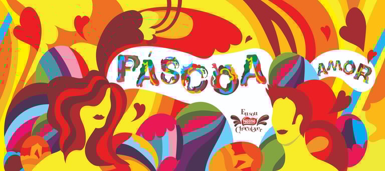
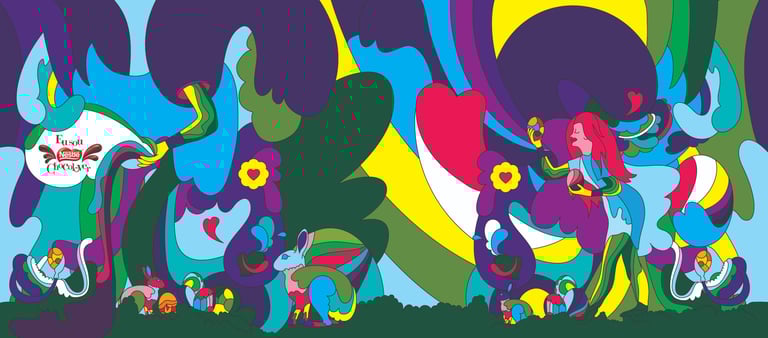
The strategy: Turn the packaging into a collectible object of desire, something a child would want to have and an adult would want to keep. The chosen territory was love as Easter’s common thread: not religion, not chocolate, but the emotional celebration that connects generations. A visual language inspired by 1960s psychedelia translated this idea into three distinct worlds, each tin with its own narrative, yet all inhabiting the same universe.
Female figures flowing through organic shapes, the bunny integrated as a character rather than a generic icon, custom typography, and a chromatic explosion that simultaneously evokes past and present. Each illustration was designed to work in 360° across the cylindrical surface of the tin, no beginning, no end, just continuous movement.
The Result: Three tins, three stories, one cohesive universe. Packaging that became a keepsake and a reminder that Easter can be much more than a chocolate egg. It is celebration, it is affection, it is love.
Obrigado pela visita!
Para agendar uma reunião ou um café: hellocako@me.com